Wilo Pumps
Proposed User-Friendly and Accessible Pump Selection Process
Platform
B2B Web App
Role
Sr. UX Designer
Industry
Business & Enterprise
Team
2 UX Designer, 1 Project Manager
Timeline
3-4 Weeks

Context
The Wilo Group is a global leader in making high-quality pumps for buildings, water management, and industries. They provide reliable and efficient solutions to meet the needs of different industrial environments.
It offers a tool for their customers to select pumps based on their requirements, enabling them to make enquiries and requests for quotations. They want revamp the current tool to enhance usability and simplify pump selection process with pump comparison feature. Create new dashboard, tickets, enquiries and quotation management page.
My Role
As a Sr. UX designer, I focused on simplifying the pump selection process. My role included defining the product goals, developing ideas, making detailed prototypes, and setting up the design system.
🎯 Challenge
The biggest challenge is the complexity of the current tool. The client shared feedback from some users who found the tool is too technical, cluttered, and hard to navigate.
✅ Solution
Improved the overall user experience by simplifying the pump selection process and adding a pump comparison feature. Created a user-friendly dashboard for better data visualization and insights. Enhanced ticket, enquiry, and quotation management for seamless tracking and efficiency.
Design Process
Followed a user-centered design process to improve the experience, took client interview to gather requirements and understand pain points. Conducted heuristic evaluations, created user persona and story to understand use cases, refined the information architecture (IA), and designed wireframes for the pump selection process to guide the final design.
🧠 Understand → 📝 Specify → 🎨 Design → 📋 Evaluate
Heuristic Evaluation
As the first step in the redesign, I evaluated the current process using heuristic evaluation to identify issues.


User Story
Developed user persona based on insights from client interviews and created user story to map out use cases and define clear goals for the redesign.

User Pain Points
We identified the following pain points through heuristic evaluation and user stories.
- ❗ Cluttered interface with complex tables, confusing labels, low text visibility, and inconsistent design.
- ❗ No clear process, making it hard and time-consuming to find the right pump.
- ❗ No comparison feature, making it difficult and time-consuming to compare pumps manually.
- ❗ Lack of integration for managing tickets, enquiries, and quotations.
- ❗ No data visualization for better insights.
Ideation
Here are some key 💡hypotheses for the redesign to achieve optimal outcomes.

Information Architecture
Enhanced information architecture to oraganise the flow with focus on the pump selection process.

Low-Fidelity Sketches for an Optimized Pump Selection Experience.

An Inside Look at the Streamlined Pump Selection Workflow.
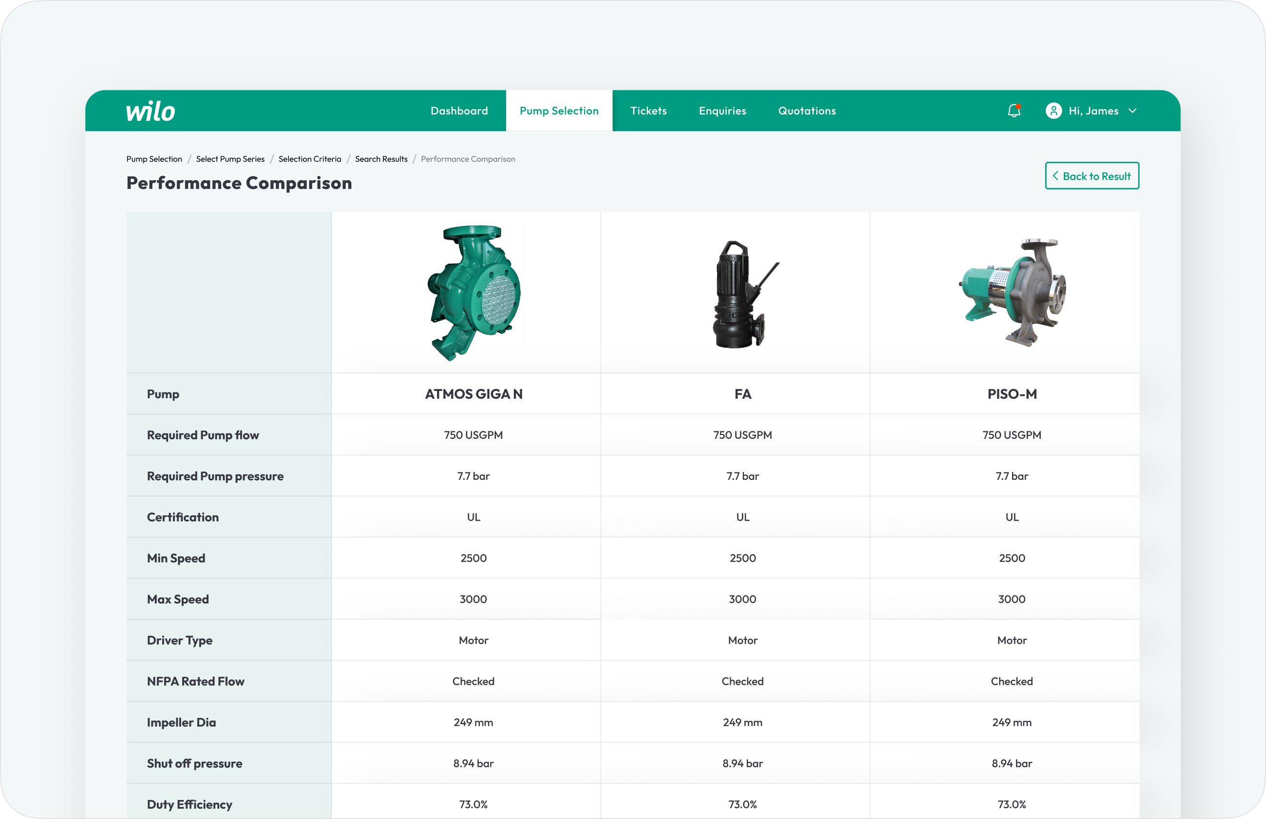
Side-by-side performance comparison feature that helps users make more confident decisions.
Created an easy-to-use and reliable tables for managing tickets, enquiries, and quotations.

Integrated Kanban View to Organize and Manage Enquiries & Tickets.

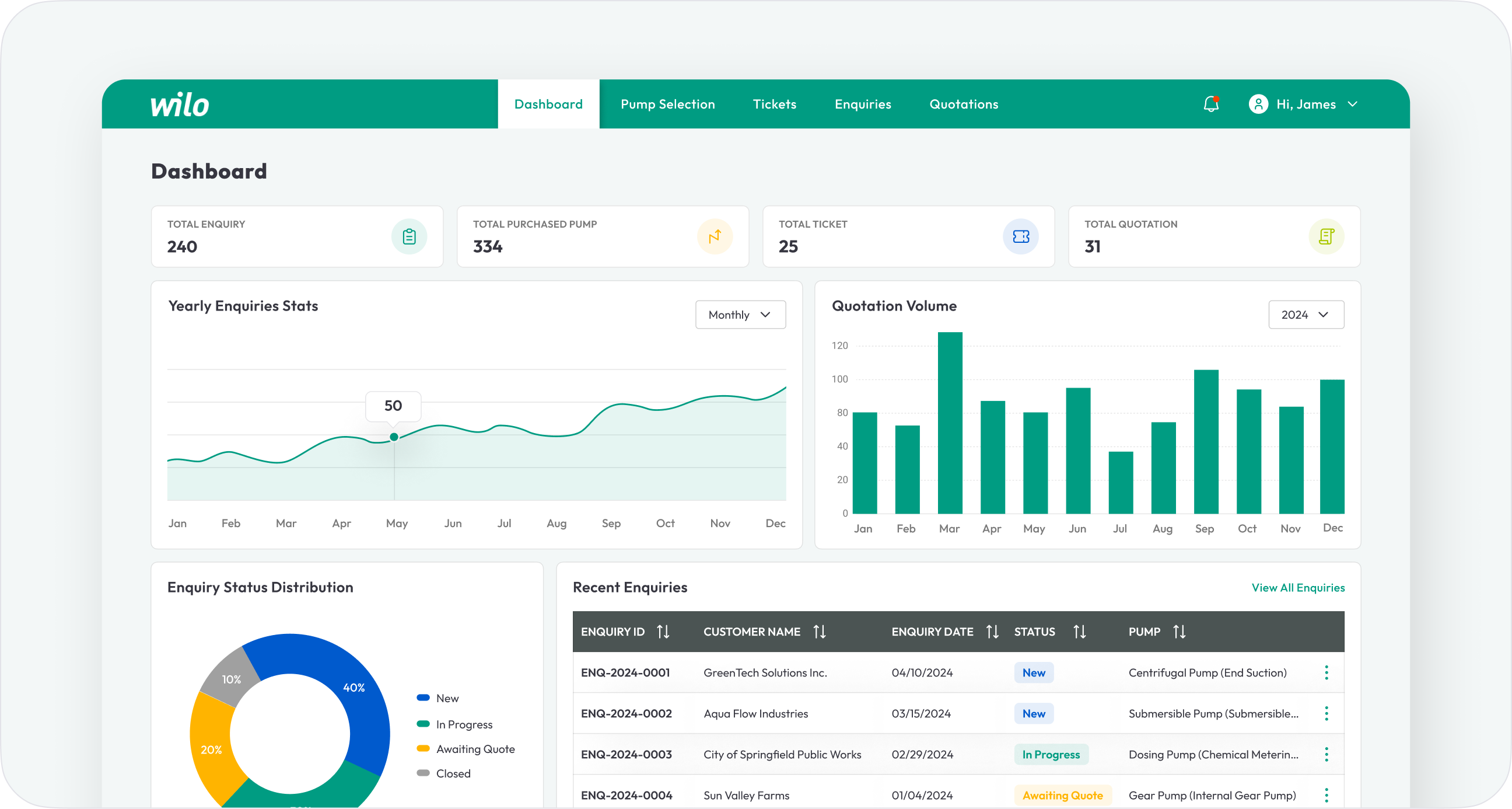
Built a Dashboard that Drives Efficiency and Clarity.
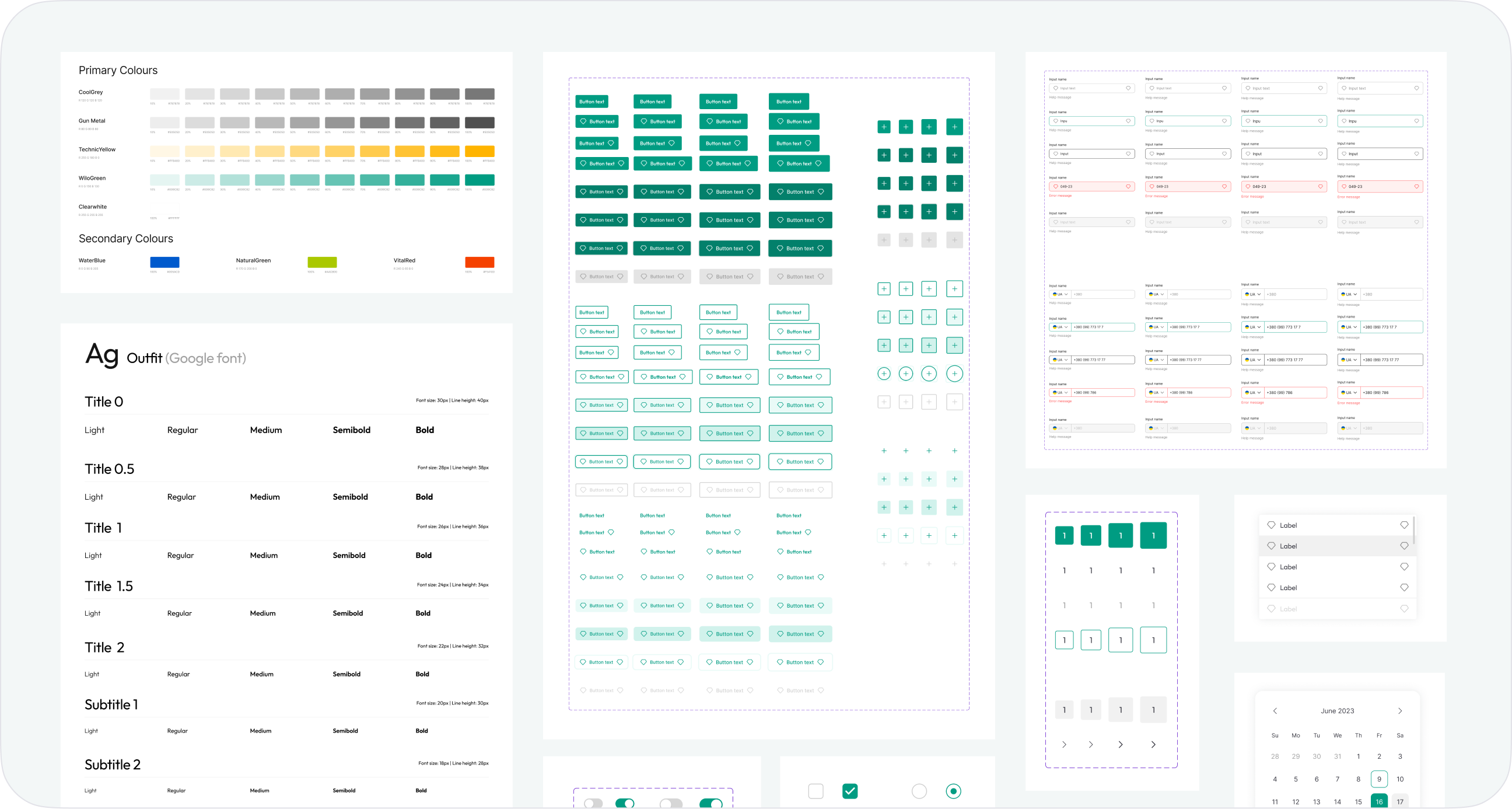
Visual Consistency through Style Guide and Component Library.
Result
We evaluated the design with the client, and they liked it. The work is still on hold, but implementing this design will improve the overall process.
👨🏻💻
Can improve overall product usability, accessibility, and consistency.
⏳
Can enhance task completion time, readability, and reduce cognitive load.
🚀
Can boost efficiency, user satisfaction, and task success rates.
📈
Can increasing feature usage and user engagement.
Canbiz(Simventure Validate)
- Web & Mobile
- Redesign
- Business & Enterprise Application